Examples of books from different genres
Activity book

 These images show a storyline where it gets the audience to illustrate their own type of clothing or accessory that the characters are meant to be wearing. Again this gets the children to use their imagination and make up their own style. Therefore, this utilises one of their fundamental skills of using their hands.
The text is aligned in a playful manner and adds to the way on what some of the characters are wearing or holding.


Sticker album
 A book that tells the audience to use stickers of their choosing to fill in the characters clothing or to complete a scene. The purpose is to keep the audience, (children in this case) enthusiastic to the album.
 There is not much text, so the age for this book is for children who have started learning to read so roughly 2-4.


Another activity book example.
This book is mostly a hand rendering book but contains a variety of ways to teach the audience how to think in terms of memorising characters, what belongs to what; in this case, animals name and what food they eat. It also includes a page where it asks you to complete a sentence, which is great for children to be taught on grammar.


A picture book with a visual effect
 The pages in this book has been designed to give the visual effect that that you are falling into a hole. The reason why I took an interest in this is because, the pages are experimental, and visually it looks as if your in the story, so it engages the audience into reading it further.
This style where you experiment with pages as additions to the story could be a style that I could use to engage my target audience.


A recipe book
This a recipe book for children that could be in my estimation as young as 9 because, the content is quite informational and it is to be used when accompanied by an adult.
 As far as the content is concerned it gives a list of ingredients for you to cook some recipes. The illustrations are friendly and eye catching that is more appealing to the child audience.

Guide to edible gardens
This gives a whole range of content that encourages children from schools to grow their own edible plants.
 The good thing about this book is that it gives a whole range of content from health and safety, how to design your own garden, how you can keep a check on your progress through growing edible plants etc. It is for children that are in schools from
ages 7+ to be taught on organisational skills.


The relevance between all these books is that, in terms of design, although two of these books are more informative, (recipe and edible garden book), it teaches them skills that will benefit them in later life when the time comes for them to be independent. The recipe and garden book are quite informative which I think is suited for children who have more advanced reading and organisational skills. An example would be children aged 9 years and up. The activity and picture book are more engaging and visually experimental and less use of text particularly for children who have started to learn to read maybe targeted at the age of 5-7.
Looking back on what I have researched up to this point, I decided to make an activity book because, I think this can get the younger audience can learn more as they get involved more on the practical side instead of the tedious way of just sitting down and reading.
Some picture or activity books as I have mentioned, contain text that have been manipulated to suit the style of the picture book as with the example of the activity book above. Therefore this brings me onto research about typography as I want to learn how letterforms are designed so that I can use my own typestyle and experiment in any way I want.
Typography
Where type is used
Type is everywhere. It is on almost everything we buy, on the pages of books and magazines, on walls, floors and street signs. There are many typeface varieties and each possesses a distinct personality.
Typeface
A typeface refers to a specific design of an alphabet-and there are hundreds. The difference between one typeface and another is often quite subtle, quite difficult to detect the difference, it may be no more than a slight difference in the shape or serif, the length of the ascenders and descenders, or the size of the x-height.
Typestyle
A typestyle is used to emphasize a specific word or sentence. The most common and widely used typestyle is roman, in which the letterforms are upright. Next is italic, which the letterforms slant to the right and is used mainly used for emphasis. Other typestyles such as small caps, others by varying weight (thickness of stroke): thin, light, semibold, bold, extrabold are also used for emphasis.
Examples are some of the basic typestyles are:

Line Length
In general, the length of a line of type should be comfortable to read: too short and it breaks up words or phrases; too long and it can be fatiguing as the reader must search for the beginning of each line.
Text hierarchy
Text hierarchy is a logical and visual guide, which allows the variety of headings that normally accompany body text to be organised. The hierarchy indicates different degrees of importance through the use of point sizes and/or type style.
X-Height
The x-height is the height of the lowercase letters letter excluding the ascenders and descenders. Although this is not a unit of measurement, it is of vital importance because, it conveys the visual impact of the type size. In other words, typefaces of the same point size may appear smaller or larger due to the difference in x - heights.
Type classification
Typeface classification is based on anatomic characteristics and usually divided between four basic categories: Block, Roman, Gothic and Script, accounts for any typefaces that do not naturally fit into any of the four basic categories. This can then be further sub classified: Block or (black letter) contains those typefaces based on german manuscript handwriting; Roman houses all the serif typefaces; Gothic contains all the sans-serif typefaces, and Script contains typefaces that mimic handwriting.

This sans-serif typeface do not have the decorative touches that typify roman typefaces. Their clean and simple design makes them ideal for display text, but may make them difficult to read in as long passages.

Script
These typefaces are designed to imitate handwriting so that when printed the characters appear to be joined up. As with human handwriting, some variations are easier to read.

Roman type has proportionally spaced letters and serifs, and was originally derived from Roman inscriptions. It is the most readable type and is commonly used for body text.

Block, also known as old english or black letter are based as the ornate writing style prevalent during the Middle ages. Nowadays, they appear heavy and difficult to read in large text blocks, and seem antiquated.
The source that I got this information


Choosing a Typeface
Now i need to choose a typeface that is suitable for my target audience (children aged 5-7), to read. If possible, be suitable for the book itself.
I've chosen to use this typeface: Apple casual
Edible plants and food
I chose to use this typeface because, it's friendly and something that looks like that it belongs outdoors. It gives me that sense of freedom, to roam anywhere I want. The bold text and letter spacing makes it easy to read.
Learning about typography got me to think about many typestyles and how each of them can affect the way in which the audience sees it and how each letter or letterform can create some sort of impact depending on what your designing. With words that can create an atmosphere of feeling, what about the illustrations themselves? There are many illustrators not just children illustrators that have their own style or techniques to create a visual depending on the target audience. In this case, learning what kind of styles children illustrators use would be beneficial as I can use one type style that I believe would suit the audience i'm targeting. So with that being said, I researched many illustrators that have their own style and to pick one that I could use but in my own illustrated design.
Illustrators
Alison Berry
A freelance illustrator, crafter and lover of books. She has graduated with a BFA in illustration. I found her blog of all her recordings on her illustrations and materials she collects for her senior show that she was doing for a major in illustration. Most of the illustrations she does correspond to what she has done, what she's doing and how she feels about something and apply's that to her drawings.
Judging from these sketches she has done some of these in watercolour.
http://alison-berry.blogspot.com/2011/02/illustration-friday-layer.html


This illustration she has done above with the girl holding layers of cake was nothing to do with her major. If I'm understanding what she described about this, even though she learned about perspective and backgrounds she didn't apply that to this illustration but she did it because, loves to draw silly things. However what some people liked about this is that they loved the simplicity, the shape of the lines and the character looks sweet to them and cute. What people have commented on her blog is that the characters just make them smile.

This illustration above was after she had graduated and it's a digital illustration she sketched this out then worked the outline on illustrator and brought over in photoshop for colouring.

Jo Brown
An Illustrator who does a lot of children's book work, but also other art based media such as ceramics, greeting cards, logos, packaging, posters etc.
Her lastest publications are:

She explains that her imagery is "happy, humorous, colourful and sometimes very busy." She works in gouache paints on flexible smooth card to create her illustrations.
She describes the paint that she uses as "she feels the paint, the unexpected mixes that work well, the unevenness, the imperfections that make it lively."
 She loves working with colour, pattern and texture and loves to add a lot of interest to the backgrounds.
 These illustrations are simplistic, colourful and there's not much text to it. This would benefit children from ages 2-4 but I chose to research these books because, of the way that the illustrations sends out a loveable feeling to me and I think it would send the exact feelings to children of any age. Since i'm targeting an audience from 7-9, I would need to add more text so that it would challenge the audience skills as an advanced reader. But as for the visuals, I could
 use this style but render it in my own way. Her blog contains a number of illustrations

Appendix A
Paula Bowles
 Works primarily for children's publishing in pencil and watercolour. Paula finds inspiration from the oddities of everyday life, from people, animals, music and especially daydreams. She loves to invent characters and the worlds from which they live, and loves words and making up stories.
Here are just some of her illustrations.
One example is a book called "Scary Mary." These illustrations are slightly more detailed than the illustrations from the last illustrators I researched but I still like the personality of the characters.


I plan on illustrating a character of my own to help teach children on the subject matter and I could plan my character by practicing how I can get he or she, (haven't decided yet), to perform different actions so that it can come to life, engage and interact more with the audience.
 From this, I have learned how illustrations are produced for children's books for example, the characters have been illustrated to look friendly and colourful to look at. I'm almost ready to start developing my own children book from the research I have gathered but I wanted to research into what media should use to make my illustration/design stand out so that I can grab the audience attention and keep them entertained.
Her blog contains a variety of sketches and development of her books:
http://www.paulabowles.blogspot.com/2011/06/here-are-some-little-robots-im-pitching.html
Benefits and drawbacks from using various media
Appendix B
Watercolours
Benefits
Watercolor paints are an easy art form, as far the technique and brush is concerned. The necessary ingredients required for watercolours could be easily available in the market, along with just adding water. They are generally water soluble ink pigments, which are cheap therefore makes it affordable by the individuals.
The application of colors and the movement of strokes could be very well mastered. It is a much easier process than the others and allows us to experiment with each variety. As again they are affordable.
Disadvantages
People have to consider the after affects of watercolor. The problems is with the pigmentation, in other words the watercolors being soluble with water are more prone to water damage in the long run, where the entire painting might be ruined. When you think about the aspects of the pigment present with paper texture, we do not consider the bonding between these two. When the pigment comes off the paper the painting gets dull over the days. With that being said, people might have noted that watercolor paintings are done on paper, which tend to turn yellow after quite a few hours.

http://ezinearticles.com/?Watercolor-Painting---Benefits-and-Drawbacks-of-Watercolor-Painting&id=1655059
Acrylic paints
Advantages
Acrylic paints are water based, which means they can be thinned out with just water (no toxic spirits are required). In addition, wet paint can be cleaned off with soap and water.
They dry rapidly, so there's no need to wait between painting sessions for layers to dry.
Once they dry, they are on support to stay. This makes painting new layers on top of one previous simpler.
Disadvantage
Acrylic paints can contain toxins within their pigments. Using "retarder" to dry to slow the drying time of acrylics often introduces additional toxins.
Since they dry quickly, they cannot be easily blended to create the "wet in wet" technique (to add another wet layer to another wet layer), this can give a harsher look to acrylics when applying this technique.
Once the paint is dry, it cannot be altered or removed.

http://emptyeasel.com/2009/07/21/artist-grade-acrylic-paints-advantages-disadvantages-and-a-brief-history/
Oil paints
Advantages
Most artists believe that this type of art should be taught to every students. This has a lot to do with the fact that you can reproduce a variety of developments using these paints.
No fear of leaving your paints open as they are not going to dry as fast as other paints. This makes it easy for the artist to leave their picture and come back different sessions without fearing that the painting is going to dry up too early.
These types of paints are great for blending as you can create unique strokes that is not possible with other paints.
Disadvantage
With every advantage that is mentioned there is also a disadvantage
The slow drying of these paints could make it difficult for artists to move on to the next stage of their projects.
It is possible to blend colours that one did not intend to blend.
Learning the qualities and drawbacks of different media will help me to use the most appropriate method to illustrating the best possible children book that will attract the audience.
Book formats also need to be considered as depending on what book it is, some are given it's place among bookshelves or boxes in a shop or library. With that being said, I need to research into the most common children or activity book sizes as since I'm designing a cover and two double page spread for children. I need to know what size it needs to be so that it appropriately fits in with other books that go on shelves.
The best formats to use
Appendix C
8vo
This is the most common size of a book is 8vo (pronounced "octavo" or "eight vo") roughly 8 to 9 inches tall. Books that are this size are most biographies, history and poetry etc.
4to
slightly larger books between 10 to under 13 inches tall are called 4to (pronounced "quarter"). Many children's books and picture books, including reference books etc. are this size, and, are just a little too tall to fit on may bookshelves next to normal size books (8vo).
Some bookmen feel that it's better to give exact measurements for every book. Except that these formatted terms have been around for a long time and well established in use. To sum up most books are 8vo, slightly larger ones are 4to, and big ones are folios.
Learning a few of these book formats have made me aware of the kind of common sizes that different books are made to. But in this case the format 4to is the one to go as the source tells me that children's and picture books are developed at this format.
http://www.babcockbooks.com/bookSize.php#4to
Appendix D
Advantages and disadvantages between using paper and card
With the format now decided I need to know what material to use to construct my book because, I want to consider the robustness of the material and to make sure that the viewer doesn't accidentally rip it.
Advantage of using paper card
Card stock is paper stock that is more durable than writing paper or printing paper. It can endure for longer periods of time and not wear out.
Card has a smoother finish
Can not be easily torn as it is thicker and each type of card can vary in thickness.
Card can come in a variation of makes for example glossy, smooth or vellum so it has a higher quality which will benifit you when doing some sort of craftsmenship in projects.
You can't see bits of pulp in it. So when using an eraser it wont damage the material.
Disadvantage
As it is thick it can also be a disadvantage because it's harder to fold but it depends on the thickness of the card.
Advantage of using original paper
It hasn't got many advantages but:
It can be purchased in a pack of multi colours, so you can create something in your own way instead of using a white background for things.
Disadvantage
Paper is usually used for children's crafts. It tears more easily
You can see some pulp in it for example, when you use an eraser, it can tear it up.
Lower quality, not much of a finish to it.
It isn't acid free, tend to bleed a lot more and for the most part has a rougher texture.
http://ask.metafilter.com/113446/What-is-the-difference-between-card-stock-and-construction-paper
Examples of books for specific target audiences
Before I decided to go on to develop my initial ideas, I wanted to research on other examples of children's books that were aimed at children at specific ages. This is to get an idea of the types of illustrations that would attract a specific audience.
Appendix E
5-7 years


http://www.randomhouse.co.uk/browse/5-7-years/all
7-9 years


http://www.rbooks.co.uk/subcategory.aspx?id=5c3fb377-3d78-439f-a328-859d4450d8a9
9+ years


http://www.lovereading4kids.co.uk/genre/9/9-plus-readers.html
Since I'm targeting children aged 5-7, it is necessary to keep the text to a minimum and plenty of images to suit the audience. The research I have done got to me to learn how each book is designed in it's own way to target a specific audience.
What kind of food is out there
Lastly, and this is the most important of research is what kind of food is out there and I came across a list of the top 10 foods to forage. This is important research as there wouldn't be much of a foraging book without much knowledge of what food is edible to find in the outdoors. Here is a few details on where to find theme, when to look for them and how to cook them. I may end up choosing other foods for the book but it depends what goes with what, it should be clear to the audience on how food is cooked and what food can go with what.
1. Mushrooms

Neither animal nor vegetable, mushrooms are a type of fungi and the largest living organism on the planet. Wild mushrooms grow across most of the UK. Parks and woodlands are a good place to start; the New forest is said to be particularly rich. Due to the diversity of our native species, there are some varieties in season, but autumn is the prime mushroom picking time as well as September and October.
Always take a knife to cut them from the base instead of pulling them out from the ground.
2. Wild Garlic

A good all rounder. Widespread and found across the UK, it's easily harvestable throughout the year and is versatile and delicious. It tastes much like regular garlic but has a milder flavour than cultivated cloves. Use the leaves to spice up a winter kind of salad or stir fry, or use to add flavour to soup and stews. The flowers are used in the same way but appear in spring, adding a flash of colour at the same time. Bulbs can be harvested all year round.
3. Elder
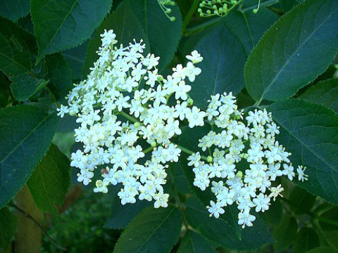
There are more uses for elderflowers than for any other type of blossom. The aromatic blooms can be eaten raw, cooked, dried or powdered, and added to cordials, wine, salads, fritters, ice-cream, cakes, biscuits, jellies, jams, sweets, tea and meat dishes, as well as to beauty products such as skin lotion and eye cream. Elder bushes are usually covered in sweet-smelling flowers by the end of June, followed by berries between August and October. Elderberries can be put to the same uses as the flowers but the leaves and stems are poisonous.
4. Seaweed

Seaweeds is a great addition to both bath times and mealtimes by virtue of it's rich vitamin and mineral content. It's extremely tasty and easy to prepare - 15 seconds in a hot wok with a little oil is all you need. It can also be boiled, steamed or smoked and used in everything from paella and risotto to salads and soups, bread and cakes and even chocolate fondant and green tea ice cream.
You can find them from any coastline with exposed rocks - the more rocks, the more variety of seaweed available. Seaweed gathering is best done when the tide is low. To avoid over harvesting, leave the roots and some of the fronds intact.
5. Dandelion

6. Nettles
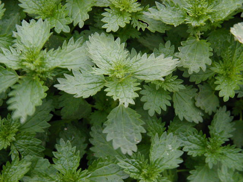
Another plant pariah, nettles tend to be avoided thanks to their well - known propensity for leaving painful welts on the hands of the picker. Once you've bought some gardening gloves, you wont have any problems. Among other things, they can be used to make tea, soup, beer and even haggis. Boiling will get rid of the sting.
Packed with vitamins and minerals, nettles contain more vitamin C than oranges. Nettles should be harvested before the flowers appear in early spring and only the youngest leaves should be chosen; mature leaves can damage the kidneys. You can find them in gardens, woodlands, pastures and orchards.
7. Hawthorn

Hawthorn berries, bountiful in autumn, make a tasty jam or fruit bread - you can try adding the dried and ground fruit to flour for a fruity loaf. Hawthorn can also be used for medical benefits and can help treat heart and circulation disorders.
8. Berries

Abundant, tasty and packed with vitamin C, berries are one of the easiest foods to forage. They are often found in accessible areas and there's so much variety, you can't go far wrong. Among the most common are blackberries, raspberries, mulberries and sloes, and uses range from juices and cordials to jams and jelly, pies ad cakes, wine and gin, and ice cream. Berries are found in woodlands, hedgerows, and parks from late summer.
9. Nuts
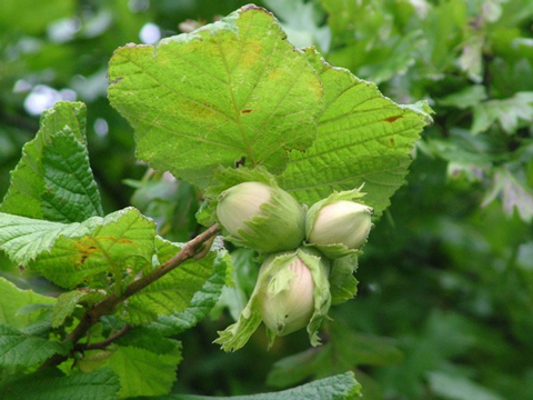
Nuts are rich source of protein and energy for hungry foragers, but bear in mind that nuts are relied on by many birds and animals, so take a few. Autumn is the best time to forage for them, to keep them dry and warm once picked. Eat them as they come or roasted. More nuts can also be used as a replacement for protein, so work well in nuts roasts and nut breads, or mixed into salads and stir-fries for extra crunch. Favourites include chestnuts, beechnuts, hazelnuts, and walnuts. Grabbing for pignuts was once a popular past time but is now illegal without the landowner's permission.
10. Mallow
 Mallow leaves have a mild flavour and a distinctive gummy, glutinous texture, making them good for bulking up salads. By the same virtue they can be used to treat constipation and diarrhoea, soothing the digestive tract, as well as helping a dry throat or chesty cough. Deep-frying the leaves makes satisfying green 'crisps', while the seeds have a delicate nutty flavour. Mallow is widespread from spring to midsummer in open and sunny habitats such as roadsides and pastures.
Initial ideas

1. One idea is to create both a sticker book and a colouring book. The format is going to be 10 inches tall and 13 inches wide. The cover page will have the box of coloured pencils stuck onto the front along with a sticker album when you open the book.
This is teach them about organising yourself, being aware of safety precautions before doing anything and engaging them by using their own imagination and draw up their own ideas on what edible food is what, where they are found, how to cook them etc. Therefore some adult assistance is required when cooking things and what equipment is needed so that they know what to do next time by themselves.
One example for content one double page spread content consist of where you find the edible flora and and what plant they are grown from.
I've designed it in a way that lets the audience figure out by the use of stickers to stick the visual to the right shaped blank space and to draw out the background that the plant or fruit is located in. So it gets them think and use their minds more. it is like a little story as well because, I've sketched out each sub topic that works together to get the person from A to B.


Final Solution
Here is a presentation of my final preparation of my work to date. The presentation includes what typeface I have selected, my considerations for a front cover to the book and more importantly how the content is laid out.
https://docs.google.com/open?id=0B5SEE1NxnTpUYmFFRXRXb3pTdWkyQnBxLVdjVFp1QQ
Research on book covers
1.

Basically the background drew me into this cover because, it gives me the inspiration to produce something in relation to my book since it is based for outdoor kind of activities.
What I think doesn't work the is text "the adventures of" it doesn't fit in terms of the content for example, the color is doesn't fit on top of the background which nearly makes it illegible and the typeface as a whole. If it were be the same as the black experimented text then it would make it stand out more.
2.

I love the illustration of the character and the colours fits in to the story. It may be scary to some but children but it makes up for that with the illustrations, and i like the how the word "bump" is played to make the impact of the sound.
3.

What I think that lets down this illustration is the way that some of the eyes are not drawn or made visible enough. For example, the duckling on the second right. It looks like he only has one eye.
Possible front cover designs.
1. One concept I would like to try is using a rough, cheap material that I want to use as the background for my book which will relate or something that belongs outdoors. Resemble it as a outdoor activity book.
2. I'm thinking of using a guide or a character that will guide children through the activity book but I want to make he or she stand out so I could use some kind of material to make the character 3D and the speech bubbles so that the audience is turned towards the character.
3. I may use photography for the background but that's a maybe.
Design concepts on the character and front cover.
These are my illustrations of characters that could be included to keep the audience occupied and entertained and the purpose of this is to guide them through the book.
I've drawn these characters performing different actions so the character can lighten up the atmosphere.
Nugget the Squirrel


Beaky the Bird


Doug the Dog


I'm not sure which character would be the best one to go for but I illustrated all of them to be as innocent and cute for the younger audience as possible because I think it's a way of grabbing their attention.
Some concepts for a front cover
The rough sketched edges of the background are to make it look like that it should be used and belonged in the outdoors. This is to represent the front cover that is covered in natural materials, (leaves, grass, a bit of sand maybe to name but a few) but I need to be careful as I don't want anything coming off and getting dirty and as long as it doesn't get too fidgety to hold. The colours aren't part of the cover but just a representation of the background. This is a finalised concept done on illustrator.


Here is a prototype of my 1st page, it includes the character talking to the audience and guiding them through the book. I need to make room though for the activities to put in.

2nd Double page spread
One of the 2nd double page spread consists of a cookery page that teaches children on how you can cook the food collected and freshen up the taste of it.

Also I need to be careful with the text as it may be too small to read and it again does take up a lot of room. I need to find a way to make it short and sweet and at the same time, it makes sense to the audience.
Research Task from the trip to the book fair.
1.


A sticker book that consists of different shaped stickers.
This is an activity book that is from an exhibit with other varieties of the same category books that has become a publishing trend to educate kids in all sorts of ways, to help them and teach in terms of practical and coordinated uses.
This example encourages the audience to come up with the visual that the book has instructed them to perform. It teaches them about how to illustrate this with the use of block shaped stickers. So it gets them to think and problem solve.
It's innovative because it provides instructions on getting the audience to think and choose the right shaped stickers that fit together to create the visual that the instruction is asking them to create. It teaches the younger audience how to problem solve and to think creatively.
The colours and illustrations have been used appropriately because it gives the audience the sort of examples that the illustrator has done if kids were unsure about the storyboard or concept.
2.


A small book that has been into the shape of the main illustration.
Some of these books have been cut down to make it easy for the child to hold and the soft foam material makes it user friendly. It has been a trend as well to cut the book into an innovative shape as an added feature to make it attractive and gives the young audience a glue as to what the main character is and what this character does.
Its quite innovative in terms of the way it looks. The colours make it look attractive and the illustrator hasn't gone for the tedious, normal, rectangle A4 shaped book. The pictures are blocked coloured and the outline of the characters and other items or contraptions have been drawn in small detail. So with that being said, I think this was intended for the child aged between 2 - 4.
The design has been used appropriately as the colours and illustrations are drawn in the right way to target the tight audience it's targeting. The material that the book is made out of is smooth and easy to hold and the robustness is good.
3.

This book has a touch and feel element to it.
It is been used by illustrating the shape of the item and using a material to be stuck down in the shape of that item or clothing. The illustrators focus is to get the audience to know whats what its like to touch and feel what either character is holding and wearing. The purpose is to kick start the one of the main senses that we take for granted which is to touch and feel something. So the child will learn what it's like to feel a number of items therefore, the child gets to learn how to use one of their own senses at the early age.
It's quite innovative because, it is an added feature that teaches the younger audience about something.
In some ways it teaches them what's comfortable to teach and what's uncomfortable to touch.
What media to use to develop my final design
I've decided to use both digital and hand rendered styled material, because I think that it stands out more than using just one type of media.
For the hand rendered material, I've decided to go with water colours because you can easily mix colours to the colour you want, it dries quickly and easy to alter if a mistake is made.
Final design
Here is my final piece that has been started, as said it is been produced in watercolour. I think that this material really makes the colours stand out and I'm able to produce a variety of different tones to any affect that I like.
Front cover and spine

Back cover

1st double page spread

2nd Double page spread

No comments:
Post a Comment